
Full-Service Print & Design
From concept to installation, we handle everything in-house so your brand stays consistent.
View All Services →
Built for Local Businesses
We offer expert offset and digital printing, custom designs, and wide-format signage. From business cards to banners, our experienced team is dedicated to bringing your vision to life with quality and speed.
Learn More →CART
Print File
Help & Resources
Everything you need to set up your files correctly — bleed, color, resolution, and typography all in one place.
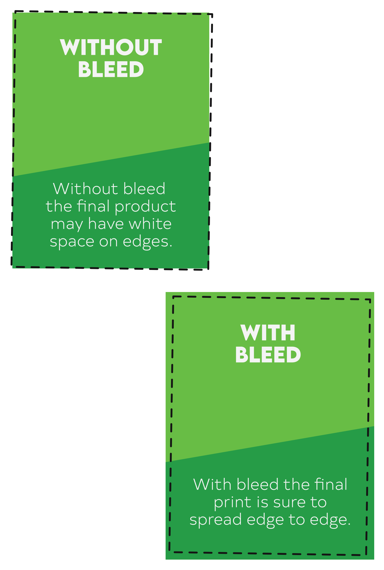
Adding Bleed
What is Bleed?
Bleed is the extra area extending beyond the final trim size of your design. It ensures no unwanted white edges appear when the printed piece is cut. We recommend a 0.25″ bleed on all four sides to account for slight variations during trimming.
Why Add Bleed?
Bleed ensures the final print has no white edges. Your design will cover the entire print surface even if the trimming is slightly off-center.
How to Add Bleed
Extend your design 0.25″ on each side. For example, if your final print size is 8.5″ × 11″, export at 9″ × 11.5″.
final trim
Note: Avoid placing important content (text, logos) within the bleed area — it may be trimmed off. Bleed is only for background colors, patterns, or images that extend to the edge.
Color Accuracy
CMYK vs. RGB
Cyan, Magenta, Yellow, Black — used for print. Always use this.
Red, Green, Blue — for screens only. Cannot accurately replicate print colors.
Always convert RGB files to CMYK before exporting your print files to ensure accurate color reproduction.
Proofing & Soft Proofing
Soft proofing checks your design on-screen using color simulation tools. Hard proofing provides a physical sample before the full print run.
We use soft proofing for most projects. If you need a hard proof for a more accurate preview, just ask our team.
Resolution & File Formats
What is DPI & Why It Matters
DPI (dots per inch) refers to the number of tiny ink dots placed within one inch of a printed image. Higher DPI = more detail and sharper prints. For professional print quality, 300 DPI is the standard.
How to Ensure High Resolution
-
Start with a High-Res Image — Avoid web images — most are only 72 DPI and will appear blurry when printed.
-
Check Image Resolution — In your design software, confirm images are set to 300 DPI before exporting.
-
Resize Correctly — Enlarging a low-res image causes pixelation. Use images at the correct size and 300 DPI.
-
Export Properly — Ensure export settings maintain 300 DPI for sharp, high-quality results.
Preferred File Formats
Typography & Design
Embedding or Outlining Fonts
Embed fonts in your PDFs or convert text to outlines. This ensures text appears correctly even if the font is unavailable on our system — preventing unwanted substitutions or formatting errors.
Minimum Font Sizes
Always test legibility before finalizing — very small fonts can be difficult to read in print.
Rich Black vs. Pure Black
For large black areas, use rich black instead of pure 100% K — it produces a deeper, richer result.
Ready to submit your files?
Have questions about your artwork? Our team is happy to help before you order.